

Michael Ward
4 REASONS TO GET TO KNOW ME
My passion for visual storytelling and persuasive design.
I’m a lifelong learner, leader, and big-thinker.
I do interesting things, like build houses in other countries.
My ability to know when not to ramble on.
I HAVE GOOD EYES AND DESIGN THINGS
I am a passionate, curious, and strategic award-winning creative leader. I have a unique blend of experience in design, leadership, and teaching at agencies, nonprofits, and higher education. Over the years, I’ve worked with tons of incredible people doing amazing things. It’s their stories and experiences that keep me dedicated to making real, positive growth.
I’ve been fortunate and have experienced lots in my life: from living around the US, traveling with Americorps, leading the construction of homes in the USA and Central America with Habitat for Humanity, to being a teacher in the Peace Corps all while creating and learning. All these have led to my diverse and unique creative perspective.

Latest Projects and Coolest Partners
-
![Flyer for 'Into the Elements' event celebrating 10 years of green visions, featuring an image of a waterfall and city skyline at sunset, with event details including date, time, location, and website.]()
Greentopia Dinner on the Bridge Event
-
![An electronic device tablet displaying a flyer for the 2022 Health Equity Conference with a photo of a woman, placed on top of a printed event flyer, with sunglasses and a red and gray pen nearby on a gray surface.]()
Common Ground Health Speak Life Event
-
![A multi-page corporate report with a cover page titled "Emerging" featuring cityscape at night, and interior pages with charts, images of people, and financial data, printed in blue, black, and white.]()
ROC2025 Case Statement
-
![Flyers with images of diverse women and children, pink backgrounds, and bold text stating 'Power Her Forward' for a women's foundation.]()
Woman's Foundation Appeal
-
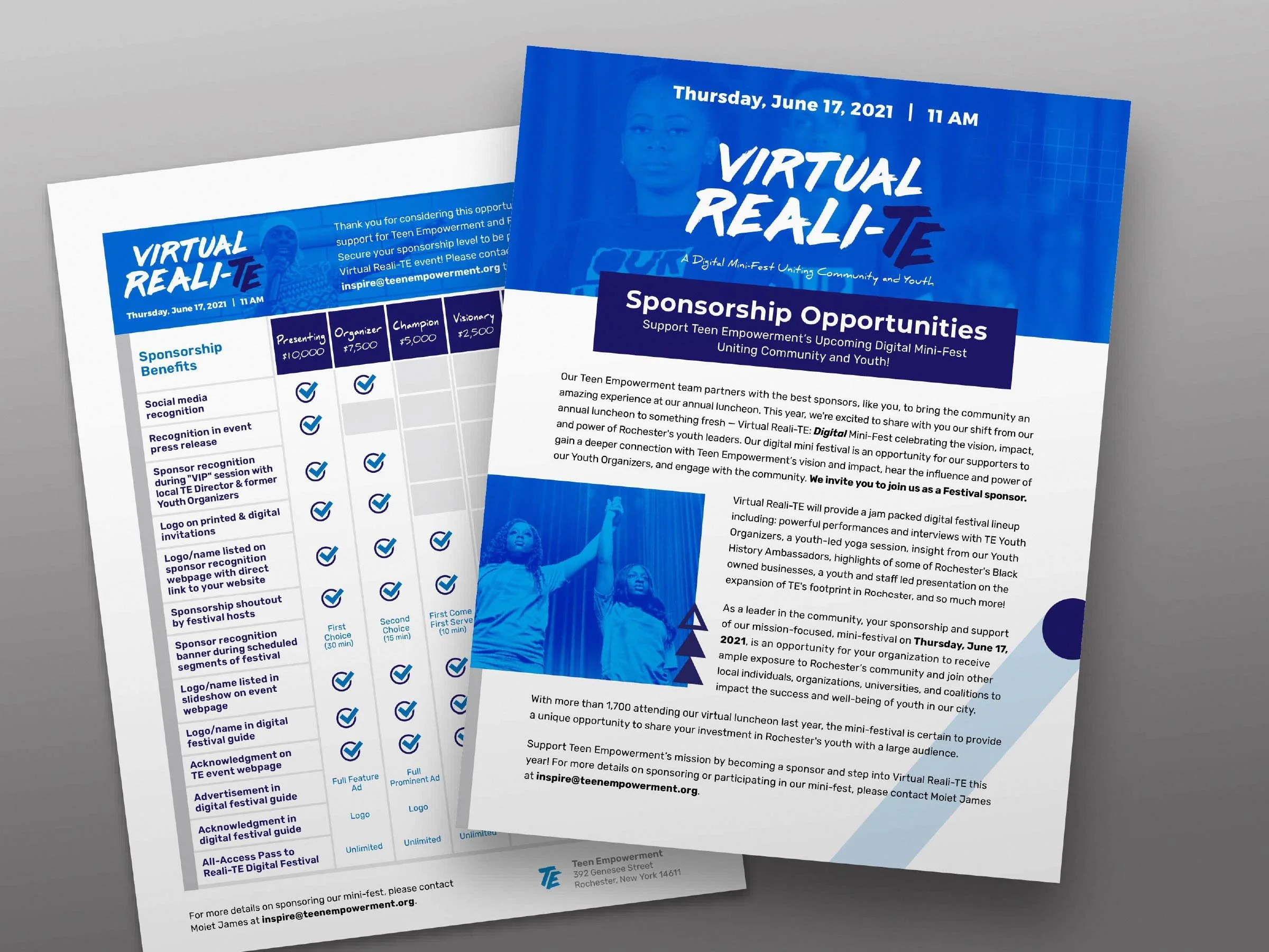
![Two brochures for the Virtual Reali-TE event held on June 17, 2021. The front brochure highlights sponsorship opportunities, and the back brochure lists sponsorship benefits with a detailed table.]()
Teen Empowerment Sponsorship Doc
-
![Brochure and pamphlet materials from YWCA, featuring a cover with a woman crossing her arms and smiling, and interior pages with images of women and information about their programs and initiatives.]()
YWCA Case Statement
-
![A flyer for Head Start enrollment featuring a woman with long dark hair, smiling and wearing a gray sweater. The flyer has colorful speech bubbles with text promoting enrollment, a logo, and the slogan 'Nurturing minds to learn, grow and play' at the bottom.]()
Action for a Better Community Campaign
-
![Two young men smiling, with one wearing a Boise State shirt and the other in a dark shirt, standing on a city street celebrating friendship. The photo promotes a championship friendship event.]()
Compeer Friendship Campaign


Case Studies

PROTECT THE VILLAGE
Partners: Action for a Better Community and The Cause Collaborative
CHALLeNGE:
Changing the harsh reality of how many men of color do not get tested for HIV and don’t know the importance.
SOLUTION:
Collaborating with The Cause Collaborative and Action for a Better Community, we developed a campaign, strategy and collateral to emphasize the importance of getting tested for HIV and protecting your community. The powerful messages Know your Status and Protect the Village are included throughout our digital (organic and paid social media, landing page), printed (posters, banners, signage) and swag materials including stickers, pop sockets, condom boxes, and t-shirts). We used peer brand ambassadors in the communities and strategic placement to help deliver the message in the communities.
Household blinds inspired the style, with the idea to stop hiding and do your part to protect the village. The dark colors, simple direct photography and lion illustrations show YOU have the power. In the campaign mark we’ve brought in the Adinkra symbol Owuo Atwedee which is the symbol for mortality symbolizing importance, further tying in the ABC brand. The mark uses the ABC brand colors and a modified version of their brand font to create a strong, bold, and memorable mark and campaign.
My Roll: Strategy, Creative Direction, Art Direction
Collaborators: The Cause Collaborative team: Founder Becca Delaney, Strategist Lauren Morgan, Writer Alexis Russel, Action for a Better Community Board members


BUILDING THE HC3 BRAND
Partner: Healthy Campus and Community Coalition
CHALLeNGE:
A rift between the college campus and community, fueled by misconceptions and mistrust, hindered efforts to build a united community.
SOLUTION:
Revamping a dormant organization with a fresh identity and name was just the starting point. Our initial discovery session revealed a more profound need for a comprehensive brand and design system to facilitate effective communication. To achieve success, I organized two brand workshops and a hero's tale workshop with key stakeholders and board members, as well as distributed community surveys to define the brand's purpose and mission (fostering a connection between the college and community to reduce substance abuse-related high-risk behaviors). These efforts shaped not only the visual identity and messaging but also the name and organization's objectives. Our design system ensured consistent communication, visuals, and brand language.
The new Hc3 mark and identity embody the spirit of community unity. The speech bubble logo symbolizes connection, bonding, and open communication among all community members. The bold, direct yet friendly typeface and design elements are reinforced by a calming color palette of blue, teal, and green, evoking trust and positivity.
My Roll: Creative and Art Direction, Design, Strategy, Facilitation
Collaborators: Shelly Wolanske Hc3 Coordinator, SUNY Geneseo Health and Counciling, SUNY Geneseo Title IX, Geneseo NY Police and Fire Departments, Geneseo Central School District, Geneseo Community Members, SUNY Geneseo Students, Local Business Owners


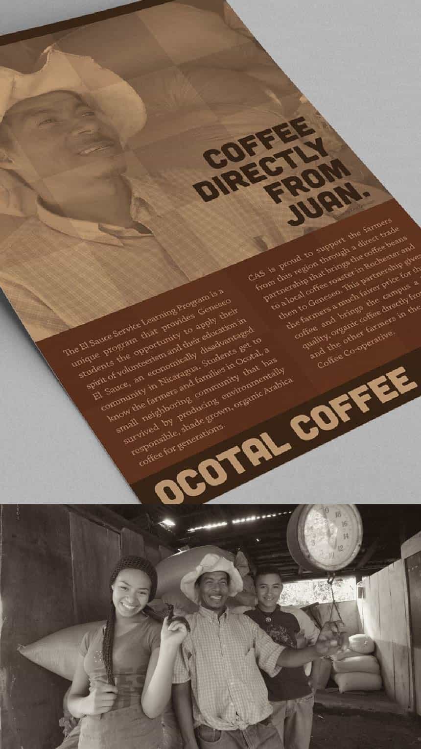
TELLING THE OCOTAL STORY
Partners: Ocotal Coffee and SUNY Geneseo
CHALLeNGE:
On a remarkable service trip, students had the opportunity to connect with Nicaraguan coffee farmers, an experience that would ultimately lead to a groundbreaking initiative. Through a collaborative effort involving SUNY Geneseo and Campus Auxiliary Services, the students worked tirelessly to establish a direct import of the farmers' coffee, which would eventually be served on campus. Amazing, but nobody knew the story.
SOLUTION:
By putting a face to the coffee, we aimed to forge connections and share the narratives behind it. This meant featuring the names and images of the farmers who grew it, alongside the personal anecdotes of students who had shared a cup with them - a cup that was also served on campus.
To bring this story to life, we conducted interviews with students, professors, and the college communications team, ultimately crafting a comprehensive brand identity and narrative. We then disseminated this story through a multi-channel approach, including press releases, social media collaborations, print advertisements, posters, and point-of-sale designs. The result was a deeply personal and relatable message that fostered a sense of community and mutual benefit among the coffee farmers, the campus population, and the service project that supported them all.
To convey a sense of authenticity and straightforward connection, we opted for a minimalist approach to the brand's name, logo, and color palette. By employing a frame-based design, we were able to incorporate a diverse range of personal photographs, showcasing students, farmers, and families together and weaving their stories throughout all media channels.
My Roll: Creative Direction, Art Direction, Interviewing
Collaborators: CAS Marketing Director Becky Stewart, Photojournalist Kris Dressen, University Professors, SUNY Geneseo Communications Department. Thank you to the El Sauce Service Learning Program and Java Joe.


GET TO KNOW ME ON LINKEDIN
I’m working on a balance between the things that make me happiest: family, design, and giving back. Like most people I only have 24 hours a day, that doesn’t leave time for everything, sorry Facebook.